New Zealand Business Brokers
Creative Direction
Logo Design
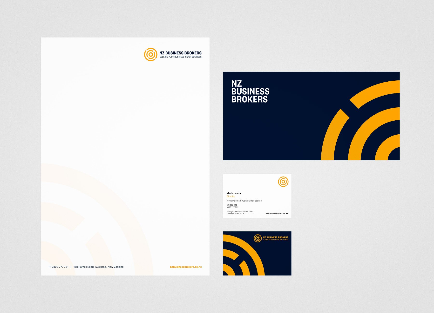
Stationary
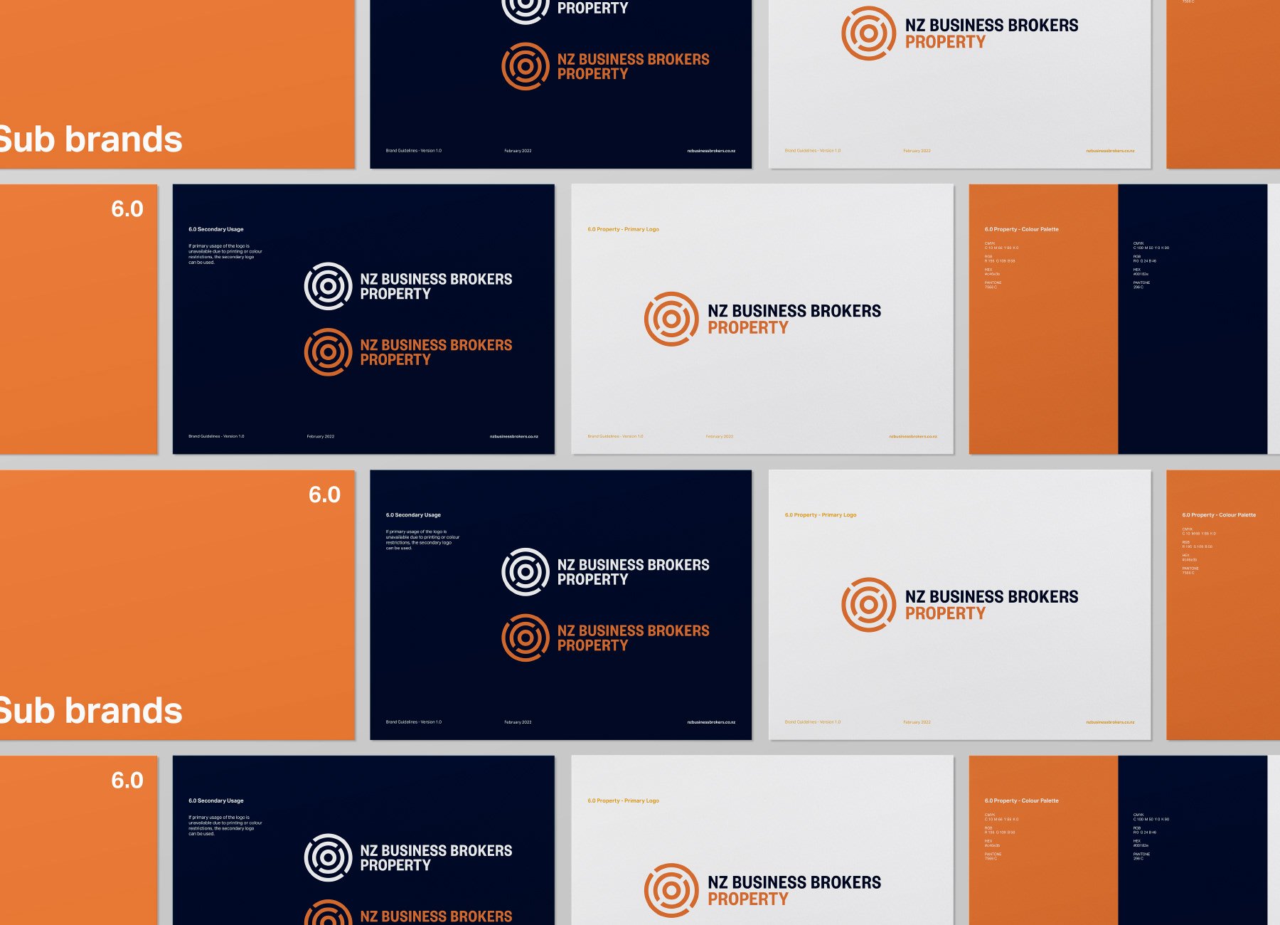
Wayfinding
Elevating a trusted brokerage with a cohesive brand identity
The Brief
New Zealand Business Brokers, a premier business brokerage firm, sought to revitalise its brand identity to better reflect its reputation for excellence and to enhance the prominence of its sub-brands in a competitive industry. The objective was to develop a cohesive visual system that aligns with the company's values and appeals to a diverse clientele.
The Approach
We embarked on a comprehensive rebranding initiative, focusing on creating a modern and professional visual identity that resonates with both buyers and sellers. The strategy encompassed logo design, stationery, and wayfinding, ensuring consistency across all touchpoints.
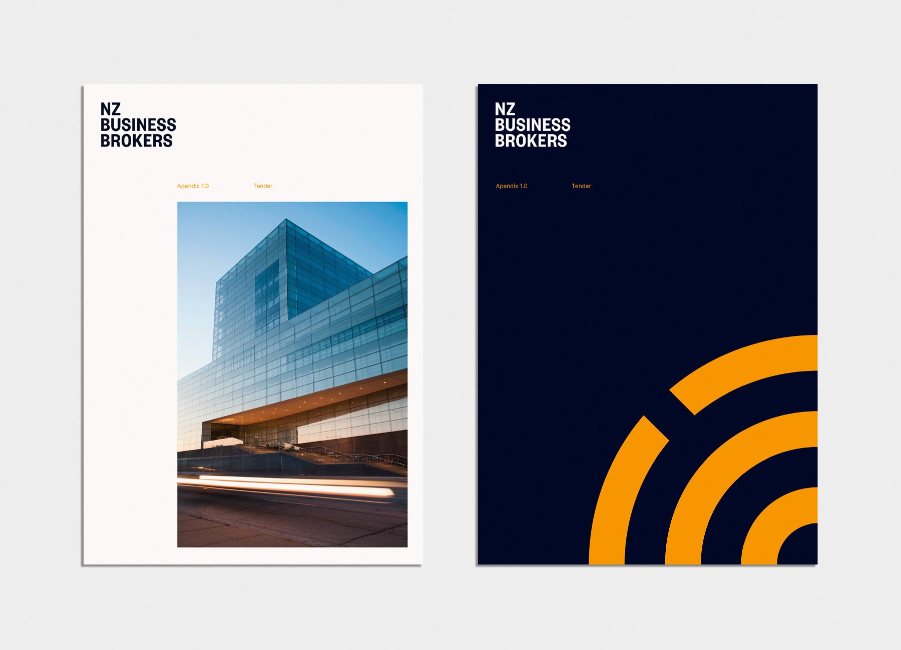
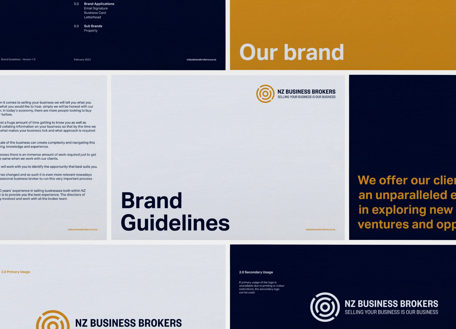
Logo Design
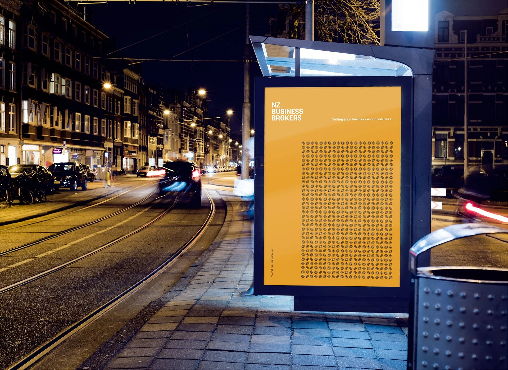
The new logo features a stylised circular motif, symbolising connection and continuity, reflecting the firm's role in facilitating successful business transitions. The design conveys professionalism and trustworthiness, aligning with the company's core values.
Colour Palette and Typography
A sophisticated colour palette of navy blue and gold was selected to evoke a sense of stability and prestige. Complemented by clean, sans-serif typography, the visual identity maintains clarity and modernity, enhancing readability across various mediums.
Stationery and Wayfinding
We developed a suite of branded stationery and wayfinding solutions, incorporating the new visual elements to ensure a seamless and professional experience for clients and stakeholders alike.
The Result
The refreshed brand identity has successfully repositioned New Zealand Business Brokers as a contemporary and reliable partner in the business brokerage landscape. The cohesive visual language across all platforms has strengthened brand recognition and reinforced the company's commitment to excellence.