Werkits
Creative Direction
Visual Identity
Empowering New Zealand businesses through strategic support
The Brief
Werkits is a New Zealand-based organisation offering customised business support programmes, strategic research, and networking solutions to help businesses thrive. They connect organisations with government and agencies, providing guidance and resources to address challenges effectively. Their clients include Auckland City Council and industry associations.
The Approach
We aimed to encapsulate Werkits' mission by developing a brand identity that reflects their commitment to empowering businesses. The branding approach focused on creating a professional and approachable visual language that resonates with their diverse clientele.
Logo Design
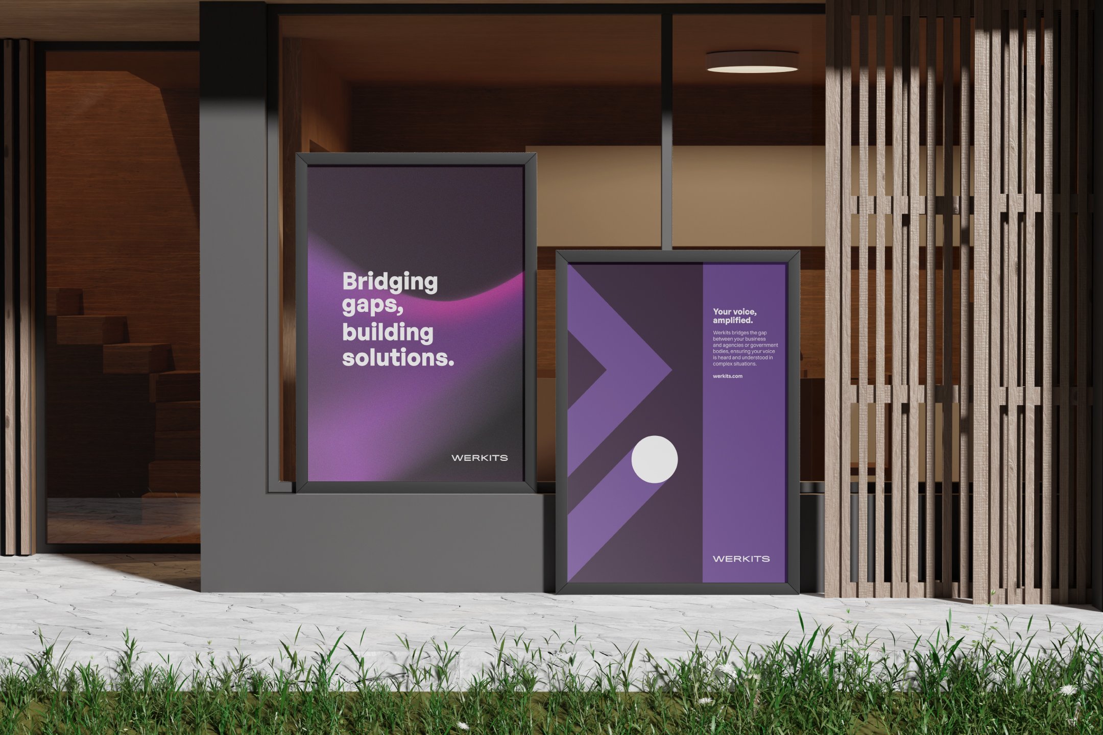
The logo features a stylised arrow symbol, representing progress and forward movement. This design choice conveys Werkits' role in guiding businesses towards growth and success.
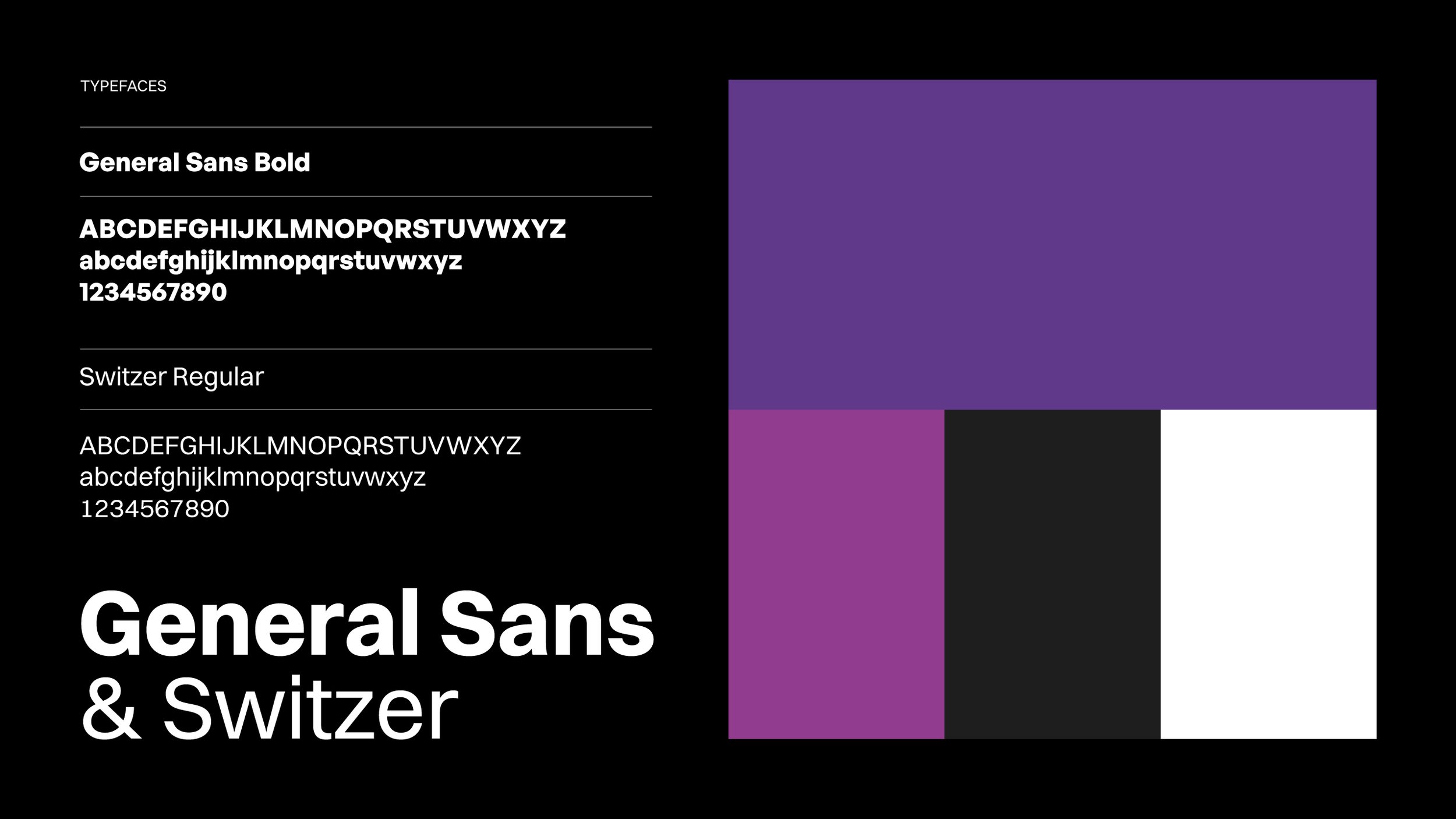
Colour Palette and Typography
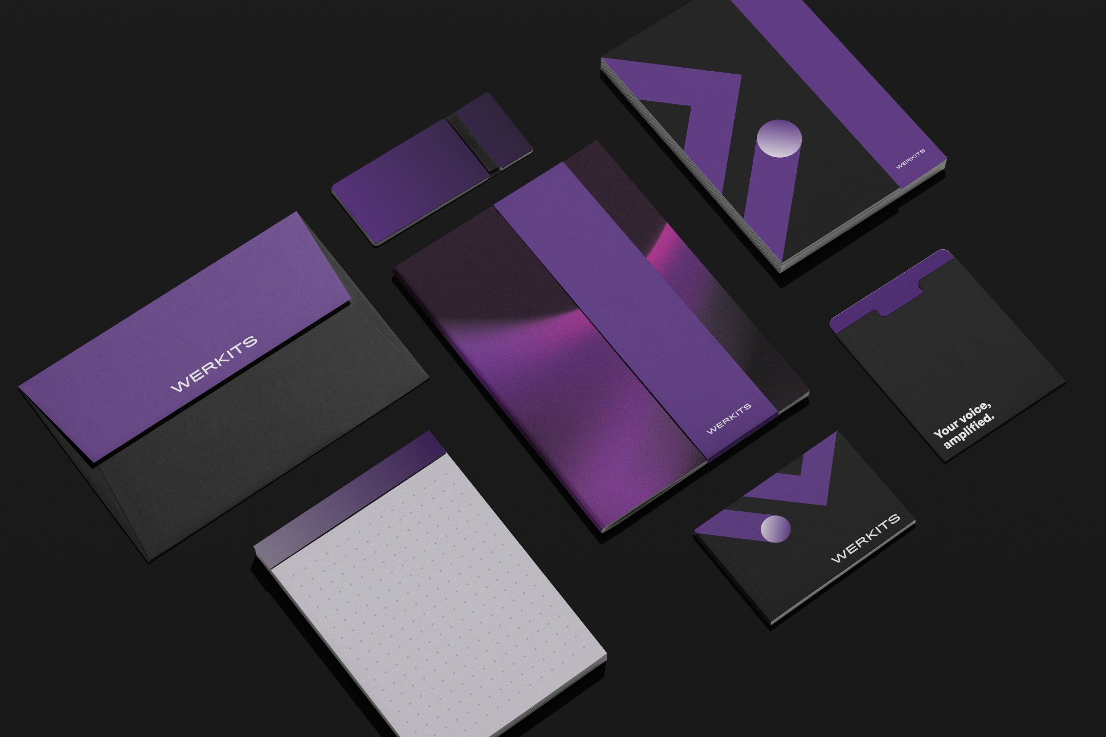
A modern colour palette of purple and grey was selected to evoke trust and professionalism. Complemented by clean, sans-serif typography, the visual identity maintains clarity and sophistication.
Visual Elements
We developed a cohesive set of visual elements, including icons and infographics, to communicate Werkits' services effectively. These elements enhance the user experience across digital and print platforms.
The Result
The revitalised brand identity has successfully positioned Werkits as a trusted partner for New Zealand businesses. The cohesive visual language across all touchpoints has strengthened brand recognition and reinforced their commitment to supporting economic development.